 Skip to content

You know that CSS Grid is the most powerful layout system in CSS but it’s hard to get started with. Or maybe you have tried and failed.
Wouldn't it be great if you could learn everything you need to use CSS Grid successfully in one place from beginner to advance concepts?
With this one-stop guide you will learn all the skills you need to succeed with CSS Grid.
Are you ready to get started? Let's begin.
I'm going with really simplified approach, so you can understand CSS grids with the easiest way possible.
Parent Child relationship in CSS Grids
You may have heard about parent child relationship in html elements.
Below is an example:
As you can see a parent has three children.
First child is a front-end developer, second child is a back-end developer and third is full-stack developer.

Fast forward, I have added some basic styles to the parent and children like colors, padding etc.

Below is the output:
- Parent in black background
- Children in different background colors

In CSS grids, we have different properties for parent and children.
CSS Grid Parent Properties:
Below are the list of CSS Grid parent properties which you will learn:
- display (grid | inline-grid)
- grid-template-columns
- grid-template-rows
- align-items
- justify-content
- justify-items
- row-gap
- column-gap
- grid-auto-columns
- grid-auto-rows
- grid-auto-flow
- grid-template-areas
- grid-template
display (grid | inline-grid):
In CSS, you are already familiar with display property right?
You can now use display: grid; (block level) or display: inline-grid; (Inline level)
If you don't know about CSS block and inline level.
block level: Which straighten the element to occupy the complete space.
inline level: It doesn't occupy any additional space other than the element or inside content.
Most of the time you will use display: grid;
So, what it does?
It gives super powers to all the direct children of parent, without it you can not use CSS grid properties.
So, it is the first and important property that you will put inside for initiating CSS Grids.
After adding display: grid; you will notice nothing because all the elements or children inside parent are div which is already block-level element, but behind the scenes, you have given so many powers to the children.

grid-template-columns
Creating columns is now easier then ever.
Lets say, we want to create two columns the first one is 20% and the second one should be 80%.


So, you see we created two columns successfully.
The third child automatically moved to the first column and second row.
Just note: These columns are not yet responsive, but don't worry we will look into the responsive part later.
You can make any number of columns.
Fr (Fraction) Unit
What if you want three equal columns.
For that, you can use the percentage as well like (33.33% 33.33% 33.33%).
But you should utilize fr(fraction) unit.
Fr unit automatically adjusts the pixels to occupy the complete remaining space.
1fr means single space, 2 means double space, and so on.
If you put 2fr for the second column it will consume much larger space than the other two.
And yes you can combine it with any other unit like 20% 1fr 160px
Not only that you can use this unit for rows as well. We will look into that later.
So, the possibilities are endless.


grid-template-rows
From our example, let's say you divide it into 2 columns with 1fr 1fr the third child will automatically go to the second row.

You see, that it has been adjusted automatically.
If you want the first row to remain the same and the second row with the row height of 200px, you will need to utilize grid-template-rows with values like 1fr 200px


Gaps or Gutters in CSS Grid
Now, you know about rows and columns and want a gap or spacing.
Let's say, you want to put 10px of space for columns and 30px for rows
You can use the property column-gap for columns and row-gap for rows.
There is a shorthand property called gap which contains row-gap and column-gap together.


minmax() function
In simple words, you are telling the CSS grid to add the limit value like min-width and max-width of the specified column.
It accepts two parameters (the minimum width of column, the maximum width of column)
Note: You can also use minmax() with grid-template-rows, grid-auto-columns, and grid-auto-rows.
Now, you can see the first column is using minmax().
If you will minimize your screen, you will see that the first column will stick on 100px.


repeat() function
What if you want 20 columns with 100px. So, instead of writing 100px for 20 times in grid-template-columns, you can use the repeat() function.
It accepts two parameters (How many columns you want, width of columns)
Example:
grid-template-columns: repeat(20, 100px)
Note: You can also use repeat() with grid-template-rows.
In our case, we have two repeated columns.
Before:

After:

min-content vs max-content
In the min-content case, the box occupies the space according to the largest content in that box.
Whereas max-content occupies the space for the whole content.


Look into 3 columns (min-content, 1fr and max-content).
You can see the children first column took the space as much as the word front-end.
And on the right side, the third column occupies space according to the entire content inside the box. So, the third column's width relaying on Full-stack Developer.
auto-fill vs auto-fit
What if you want flexible columns without defining the explicit column numbers.
Like, what if you are not sure how many columns do you need and you want flexibility or auto adjustments of columns according to the children?
In repeat() function, you can define two powerful values (auto-fill or auto-fit) in place of column number.


auto-fill automatically did its calculation and return 4 columns without us worrying about the column number.
There is a slight difference between auto-fill and auto-fit, which I will cover later. For now, let's be simple and consider both same.
grid-auto-rows:
What if you have defined grid-template-rows for two rows. What will happen to the children after two rows?

To cover up this challenge, we can utilize grid-auto-rows.
You can easily define your desired row height automatically for all the remaining rows at once.


align-items:
It is used to align children in the vertical direction of the grid cell. It accepts following values:
align-items:
- baseline
- center
- end | flex-end | self-end
- start | flex-start | self-start
- stretch (default: When you define the grid, it's automatically set for all the children)


justify-items:
It is used to align children in the horizontal direction of the grid cell. It accepts following values:
justify-items:
- baseline
- center
- end | flex-end | self-end | right
- start | flex-start | self-start | left
- stretch (default: When you define the grid, it's automatically set for all the children)


align-content:
It is used to align, grid container in the vertical direction of the grid. It accepts following values:
align-content:
- baseline
- center
- end | flex-end | self-end | right
- start | flex-start | self-start | left
- space-around
- space-between
- space-evenly
- stretch (default: When you define the grid, it's automatically set for all the children)


justify-content:
It is used to align, grid container in the horizontal direction of the grid. It accepts following values:
justify-content:
- baseline
- center
- end | flex-end | self-end | right
- start | flex-start | self-start | left
- space-around
- space-between
- space-evenly
- stretch (default: When you define the grid, it's automatically set for all the children)
Before:


After:


CSS Grid Children Properties:
Below is the list of CSS Grid children properties that you will learn:
- grid-column (grid-column-start & grid-column-end)
- grid-row (grid-row-start & grid-row-end)
- grid-area
- justify-self
- align-self
- order
grid-row:
What if you want to explicitly move the element from one row to another?
If the child is in the 1st row and you want to move to the second.
You can easily do that with grid-row.
It's a short form for grid-row-start and grid-row-end.
grid-row-start:
Here you put the line number of the row from where you are starting.
grid-row-end:
Here you put the line number of row till where you want to end.
Below is an image for row line numbers:

Let's move the front-end developer (first child & first row) in the Graphic designer's place (fourth child & 2nd row).
Row second starts with line number 2 and ends on line number 3:


Short form:

grid-column
What if you want to explicitly move the element from one column to another?
If the child is in the first column and you want to move to the second.
You can easily do that with grid-column.
It's a short form for grid-column-start and grid-column-end.
grid-column-start: Here you put the line number of the column from where you are starting.
grid-column-end: Here you put the line number of the column till where you want to end.
Below is an image for column line numbers:

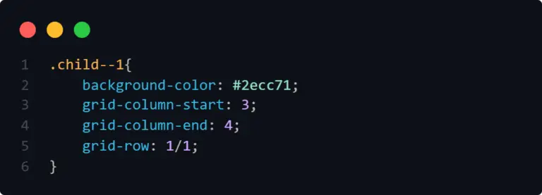
Let's now move the front-end developer (first child & 1st column) in the place of the Full-stack developer (third child & 3rd column).


Note: The other two children moved into the second row automatically. The reason is that we didn't define grid-row for this child.
By adding grid-row explicitly will fix this issue.

Spaning of CSS rows and Columns:
Now, that you have learned about grid-column and grid-row.
Here is an example of expanding the columns.
Case Column: Expand the first child to consume the space of the second column as well.
grid-column: 1 / 3; (Short form of start and end)

Case Row: Now, expand the first child to consume the space of the second row as well.
grid-row: 1/3;

Now, there is a simpler way as well. You can use the value inside grid-column or row that is span.
It means, how much consumption you want in a column or grid.
Like span 2 means, consume two columns or rows.
And yes you can combine it with the start and end concept.
Like, start with 3 and then consume 2 further columns or rows.

align-self
It is used to align individual children in the vertical direction of the grid cell. It accepts the following values:
align-self:
- baseline
- center
- end | flex-end | self-end
- start | flex-start | self-start
- stretch (default: When you define the grid, it's automatically set for all the children)
Tip: It works the same as align-items (grid container property). The difference is align-self can be used to align children individually.
Example: You may want the first children in the middle of the grid cell or the third children at the end of the grid cell.
justify-self
It is used to align individual children in the horizontal direction of the grid cell. It accepts the following values:
justify-self:
- baseline
- center
- end | flex-end | self-end | right
- start | flex-start | self-start | left
- stretch (default: When you define the grid, it's automatically set for all the children)
Tip: It works the same as justify-items (grid container property). The difference is justify-self can be used to align children individually.
Example: You may want the first children in the center of the grid cell or the third children at the end of the grid cell.
grid-template-areas
It's an optional and powerful CSS grid parent property. I'm placing it here, so you can grab the concept easily.
You can use it after defining grid-template columns or rows in the parent.
You can easily name the desired grid system like where to place the first child and where to place the second child so on.
Let's say, we have the below layout.
Now, I want to place the grid items like:
- front-end (first 2 columns and in the first row)
- back-end (3rd column and in the first row)
- graphic designer (first column and second row)
- digital marketer (first column and second row)
- content writer (first column and second row)
- full-stack (All columns and last row)
Normally, you can do this with grid-column and grid-row property right?
But, instead of using them, you can simply use grid-area to name each child.
Before:

After:

In Parent:

In Children or items:

The best part is you can now simply change the complete layout with grid-template-areas.
Let's say you want:
- full-stack (first 2 columns and in the second row)
- Graphic and Digital (third row but first two columns)
Note:
You should always fulfill grid placement. Otherwise, it will break the layout.
Like below, you can see in order to fulfill the third column in the last row I put the dot (which will consider as an empty column)


I have already explained what is necessary for this property, but you can always visit MDN Web Docs and learn grid-template-areas if you need further knowledge.
Grid Structure and Terminologies:
Grid is composed of grid lines, grid tracks, grid cell, grid area, grid gaps, grid item & grid container.

Grid Line
Vertical and horizontal lines, that divide up the grid and separate the columns and rows are called grid lines.
There are numbers assigned to each row and column.
From the above example: Grid Line Columns(1,2,3,4) & Grid Line Rows (1, 2, 3).
Grid Container
The container, where you will give superpowers. You can call it the main parent css grid container where you can define how many columns, rows & gaps you want.
Grid Item or Child
It's the direct children inside the CSS grid container. Let's say the parent has 3 Children or a grid container has 3 items.
Grid Cell
You can consider it a block where you can place the grid items explicitly(Manually) or implicitly (By force).
Grid area
The area between two vertical and two horizontal grid lines is called a grid area.
Gid tracks
The space between two grid lines is called a track, no matter if it's vertical(column) or horizontal(row).
Example:
Grid Column track (1 -> 2, 2 -> 3, 3 -> 4)
Grid Row Track (1 -> 2, 2 -> 3, 3 -> 4)
CSS grid Gaps
The space between the rows and columns is called gaps or gutters.
FAQ
Here, I will answer the most asked questions in the CSS communities.

Q. Is CSS Grid useful?
Yes, it is super useful. Most Companies build their frameworks or design systems on top of CSS Grids.
Q. Is CSS Grid Important?
If you are claiming that you know to write CSS and don't know about CSS grids, then you must start learning it. It's important just like CSS flexbox.
Q. Is CSS grid supported?
Yes, in modern web development, CSS grids are globally supported on almost all the latest browsers. You can see the global adoption in browsers from caniuse website.
Q. How CSS grid Works?
It works in both directions, horizontally and vertically. In comparison, CSS flexbox works only in one direction, either horizontal or vertical.
Q. When Use CSS Grid?
When you think that the CSS Grid can solve the layout problem much faster and better than flexbox.
Q. When was CSS Grid Introduced?
According to Wikipedia, CSS Grid was first published on April 7, 2007.
Q. Is CSS Grid Responsive?
By default, it is not. But it's very easy to create responsive layouts with Grids.
Q. Can CSS Grid Be Nested?
Not at the moment, developers are waiting for this feature to be available in all the browsers. Right now, modern firefox has this feature that is only browser-specific and the concept is called sub-grids.
Very Important:
Guide under process: I'm writing and publishing this guide daily.
If you want to get updates, make sure to subscribe to our newsletter and allow notifications.
One more thing, I'm also working on CSS grids eBook, Cheat-sheet and Course.
Stay Tuned.
Our Coding guides:


1 comment
canadian pharmacy online
Wonderful web site. Plenty of helpful info here. I am sending it to several friends ans additionally sharing in delicious. And certainly, thanks in your effort!
Wonderful web site. Plenty of helpful info here. I am sending it to several friends ans additionally sharing in delicious. And certainly, thanks in your effort!