 Skip to content
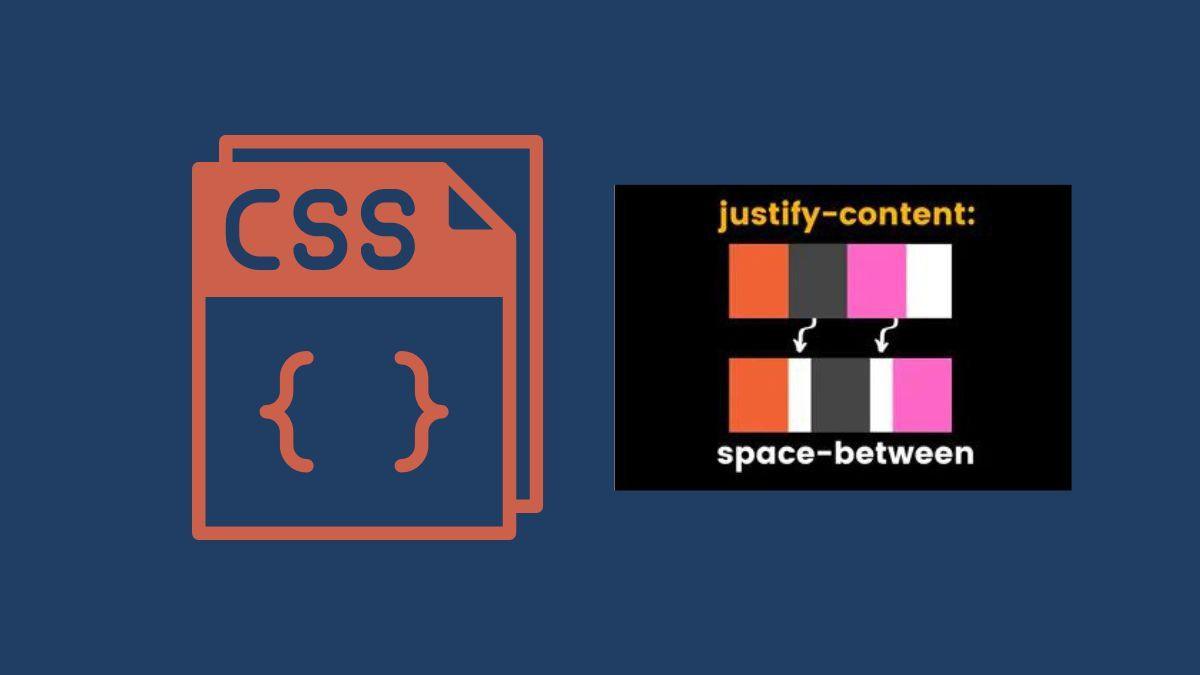
Adding equal spacing between columns was a huge pain with native CSS.
With CSS flex spacebetween, you can quickly add equal spacing between flex items or children.
Below are the values which you can use for justify-content:
- space-around
- space-between
- flex-start
- flex-end
- center
- space-evenly
- initial
- inherit
You will mostly use space-between, space-evenly, space-around, and flex-end.
Syntax of flex spacebetween:
justify-content: space-between;
For example:
We have a flex container and inside the container, there are 3 pricing tables.
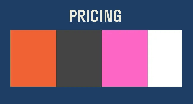
Now, in order to add the space among 3 tables.
You will need to put justify-content:space-between; on your parent container.
Tip ????: Same property will work in the CSS grid as well.
Note: Make sure to put display: flex; on container too.

If you are new to CSS flexbox, you should check a complete guide by CSS tricks their guide is pretty helpful.
Go ahead and read: A Complete Guide to Flexbox
Here at Coder Champ, you will find pretty quick and easy tutorials about web development.
Make sure to subscribe to our newsletter also if you want to quickly learn about CSS box-shadows go check it.


