 Skip to content

Making a responsive iframe is challenging, especially for YouTube videos.
When you try to embed the YouTube video inside the website, you will see that the embedded video is not properly responsive according to the aspect ratio.
Follow this tutorial if you are looking for a solution to make a responsive iframe for any use case, mainly a YouTube iframe.
Before:

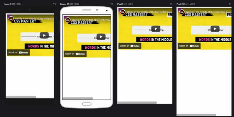
After:

Responsive iframe (Key Points)
- An outside container or wrapper around the iframe element is very important.
- Remove the static width and height from the iframe and add CSS class to it.
- Don't set the width or height for the iframe-wrapper.
For the iframe-wrapper put the following styles:
- Set position to relative
- Add 56.25% padding-top (Ratio 16:9)
- Make overflow hidden
For the iframe class, put the following styles:
- Set position to absolute
- Add 100% width and height
- left and top property to 0
Now, place it somewhere inside the parent container where you can set the proper width for your embedded video.


Our Coding guides:
- THE ULTIMATE GUIDE TO CSS 2023
- THE ULTIMATE GUIDE TO HTML 2023
- THE ULTIMATE GUIDE TO SQL AND NOSQL 2023
- THE ULTIMATE GUIDE TO JAVASCRIPT 2023
- THE ULTIMATE GUIDE TO PHP 2023
- THE ULTIMATE GUIDE TO LIQUID (SHOPIFY) 2023
- THE ULTIMATE GUIDE TO PYTHON 2023
- THE ULTIMATE GUIDE TO JSON 2023
Conclusion
In this tutorial, you learned about how to make an iframe response. You will see how often this solution can help you in your web development career.
I have another guide for you about CSS grids. Go ahead and learn to make responsive websites fast.
For more quick solutions for web development. Don't forget to subscribe to our newsletter.


